Who Talks to Whom? — finding the queen bee
You fetch the public contribution data of an open-source community, draw its network and compute who sits at the centre — the hidden queen bee who holds the swarm together.
In a nutshell
What: From a list of "who replied to whom" you build a network with networkx and
let it be drawn. Then you compute the betweenness centrality and find the person through whom the
most connections run — the hub that holds the group together.
Why: An invisible faculty — open source, open science — is a network, and networks can be measured. You experience that you can see where a group's connecting leadership sits — without asking anyone.
You need: Python with networkx, pandas and matplotlib. A
ready-made sample data list is in the GitHub repo; how to fetch your own is in the extension.
What it's about
In 1614 a pamphlet announced a secret brotherhood that shared its knowledge over an invisible network — the Rosicrucians. The brotherhood was invented, but the idea came true: in the Royal Society, which Robert Boyle called an "invisible college", and today in open source and open science. Such groups — the author calls them Collaborative Innovation Networks — are the living descendants of that invented brotherhood.
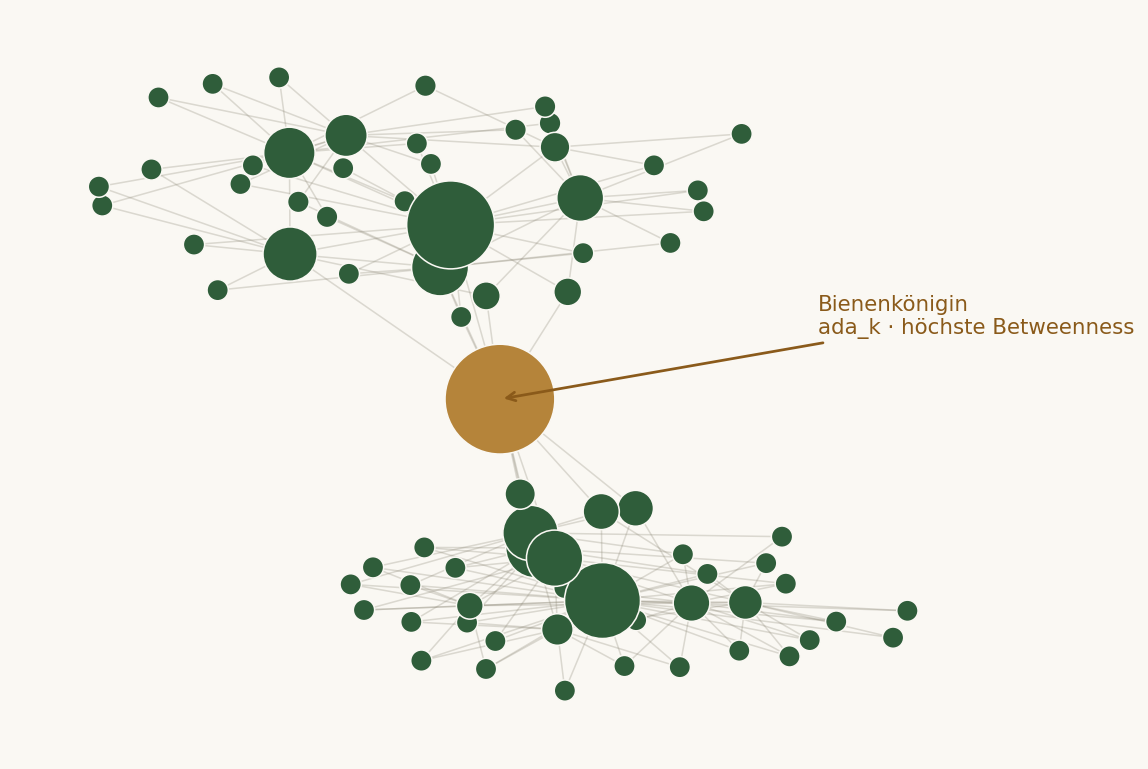
And a faculty can be read. If you record who writes with whom, the net takes on a characteristic shape: most members are connected to a few others, but a few — the hubs — to very many. These hubs hold the swarm together; they are, in the image from Chapter 6, the queen bee: not a commander, but the centre around which everything arranges itself. In Linux, Linus Torvalds sits at exactly this place — and with the betweenness centrality from Chapter 5 you can not merely claim that but compute it.
A little background
Where does the data come from? As already in 5.2, we read only the pattern, not the content: an edge list "A replied to B". Open communities provide such data freely: the comments under the issues and pull requests of a project on a platform like GitHub, or the archive of a mailing list. To get started, take the prepared sample file from the repo; the extension shows how to fetch your own data with a few lines.
What is betweenness centrality? Imagine every person wants to reach every other and always takes the shortest path through the net. A person's betweenness counts how many of these shortest paths they lie on. A person with high betweenness is a bridge: remove them and the group easily falls apart into islands. That is something different from "has many connections" — it means "connects the others to each other". This is exactly what "strong, connecting leadership" among the six signals means.
Public doesn't mean careless
Public contribution data concerns real people too. We analyse structure, not content, and we expose no one. "Queen bee" is a role in the net, not a value judgement about a person. If instead of open-source data you take your own class chat (from 5.2), the same holds as there: get consent, anonymise the names.
Building the network
- Install the packages.
pip install networkx pandas matplotlib. - Get the edge list. Load the sample file
kanten.csvfrom the repo (columnsquelle,ziel= "quelle replied to ziel", i.e. source, target) — or use your own from 5.2 or the extension. - Draw the graph. Run the script below. It draws the net with nodes scaled by betweenness.
- Identify the queen bee. Read off the person with the highest betweenness — and compare with your first impression.
Analysing with networkx
About twenty-five lines — the heart is a single function, betweenness_centrality. Full code
and sample data on GitHub.
import pandas as pd
import networkx as nx
import matplotlib.pyplot as plt

# edge list: each row = "source replied to target"
# (the repo sample is kanten.csv with columns quelle=source, ziel=target)
edges = pd.read_csv("kanten.csv")
G = nx.from_pandas_edgelist(edges, source="quelle", target="ziel")

# the central measure: who lies on the most shortest paths?
bc = nx.betweenness_centrality(G)
queen = max(bc, key=bc.get)
print(f"Queen bee (highest betweenness): {queen}  ({bc[queen]:.3f})")

# compare: plain number of connections (degree) — often NOT the same person
degree = dict(G.degree())
print("Top by connections:", sorted(degree, key=degree.get, reverse=True)[:3])
print("Top by betweenness:", sorted(bc,     key=bc.get,     reverse=True)[:3])

# draw: node size ~ betweenness (the SocialCompass idea)
sizes  = [400 + 6500*bc[n] for n in G.nodes()]
colors = ["#8a5a1a" if n == queen else "#2F5D3A" for n in G.nodes()]
pos = nx.spring_layout(G, seed=3)
nx.draw_networkx_edges(G, pos, alpha=0.35)
nx.draw_networkx_nodes(G, pos, node_size=sizes, node_color=colors)
plt.axis("off"); plt.tight_layout(); plt.show()
What you should see
A net with many small nodes at the edge and a few large ones at the centre — the typical scale-free shape. One node stands out: the queen bee. The comparison often surprises: the person with the most connections is not always the one with the highest betweenness. Whoever connects everyone (a bridge between groups) counts more here than whoever simply has many contacts.
Worksheet
Computing the connecting leadership
- Look at the drawn net and guess, before you read the numbers: who is the queen bee? Was your eye right?
- Explain in your own words the difference between "has the most connections" (degree) and "lies on the most shortest paths" (betweenness). Give an example where the two come apart.
- What happens to the net when you remove the person with the highest betweenness? Why is that a sign of their importance?
- Why does such a net have the scale-free shape (a few large, many small nodes) — and not, say, all equally large?
- The author once drew such a net from his Deloitte mailbox — without reading the emails. What exactly can you read off the bare pattern, and where is the limit?
Show solution
1. Individual. Usually the eye picks the largest, centrally placed node correctly — but not always, because betweenness measures the position in the net, not just the visible size.
2. Degree counts a person's direct connections. Betweenness counts how many shortest paths between others they lie on. Example: a person who is the sole bridge between two otherwise separate groups may have only two contacts (low degree) but very high betweenness — every path between the groups runs through them.
3. The net often falls apart into several islands that are no longer connected. Precisely because so many connections run through this person, they hold the swarm together — that is the meaning of a connecting leadership.
4. Because new members preferentially connect to already well-connected people ("those who have much get more"). So a few nodes grow into large hubs while most keep few connections — the typical scale-free shape.
5. From the pattern you read structure: who connects, who stands at the edge, how quickly replies come, whether the leadership moves — the signals of collaboration. The limit: why someone is central, what is talked about and how people are doing, the pattern does not say. For that you need content analysis (Chapter 7) — and always the consent of those involved.
When it sticks
| Problem | Likely cause & fix |
|---|---|
| Graph is a tangled mess | Too many nodes for the eye. Keep only the most active (e.g. people with ≥ 3 connections) or loosen the layout with k= in spring_layout. |
| Betweenness is 0 everywhere | The net falls apart into isolated pairs with no through-paths. Collect more data, or check that the edge list really contains replies (directed reactions). |
| Computation very slow | Betweenness is expensive on large nets. nx.betweenness_centrality(G, k=100) estimates it from a sample of 100 nodes — usually enough for the ranking. |
| Duplicate names (case, aliases) | "Mira" and "mira" get counted as two people. Unify before building (.str.lower().str.strip()). |
| CSV won't load | Separator or column names differ. Try pd.read_csv(..., sep=";"); rename columns to quelle,ziel. |
Food for thought
- An invisible faculty is a network — and networks can be measured without questioning anyone. That is powerful and delicate at once: the same map that shows where collaboration flourishes also shows who is vulnerable when they leave the net.
- The queen bee is not a commander. High betweenness means "holds together", not "decides". Whoever mistakes the measure for a ranking of importance overestimates what a network says — it measures position, not a person's worth.
- The author never read the content of the emails, only their pattern — and that was already telling enough to see that the real collaboration ran differently than the org chart claimed. Structure is an honest signal. Exactly for that reason the golden rule holds here too: aggregated for the whole, personal only for the person.
Extension
- Fetch your own data from GitHub. Through the public GitHub API you can retrieve a project's
issues and their comments and build an edge list "commenter → author" from them. A small script for this
is in the repo (folder
kap08); without an access token the rate limit is enough for a small project. - Your own chat as a net. Take the "who replies to whom" from Activity 5.2 and draw it here as a network. That connects the two activities — and do you find your own queen bee?
- Leadership over time. Split the data into time slices and compute the betweenness per slice. Does the connecting leadership move, or does it stick to one person? The moving is one of the six signals — and a good sign of a healthy group.
- Outlook: Condor / Part IV. Exactly these network maps, only in motion over time, are drawn by the program Condor. In Part IV you see how the mood and development of whole groups becomes readable from them.